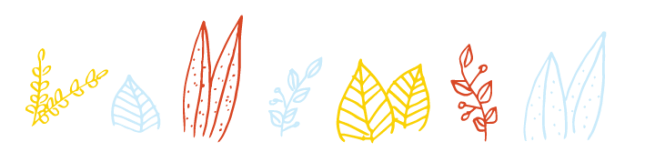
A logo is usually one of the first impressions that someone gets of you so creating one might require you to go on a personal quest to get to really know yourself. In my last post I talked a bit about my logo process, but here I will go a little more in depth of how I got to my final logo. My process started with pages and PAGES of sketches. First starting with random doodles to get my creative brain flowing and then onto more elements that defined me. I never really thought of myself as a floral-y person, but I kept gravitating towards those elements and I really had to take the time to think (and look around at all the dried flowers I have hanging on my walls and plants on my desk) and realize that maybe this is who I am! Floral didn’t have to mean dainty, it could correlate with my love for growth and nature. So I had a direction, then it was just left to deciding on which direction to go in!
Below are some of my initial sketches
This slideshow requires JavaScript.
As you could see towards the beginning there really wasn’t a very strong, singular direction, but as they started forming they started to go down a similar path. I’m very interested in hand made things whether they be drawings or DIY projects and I wanted to portray that in a way that wasn’t too literal (aka the hand sketch).
Now that we had a bit of a direction it was time to clean things up a bit and move further with them. Below are some of those sketches:
This slideshow requires JavaScript.
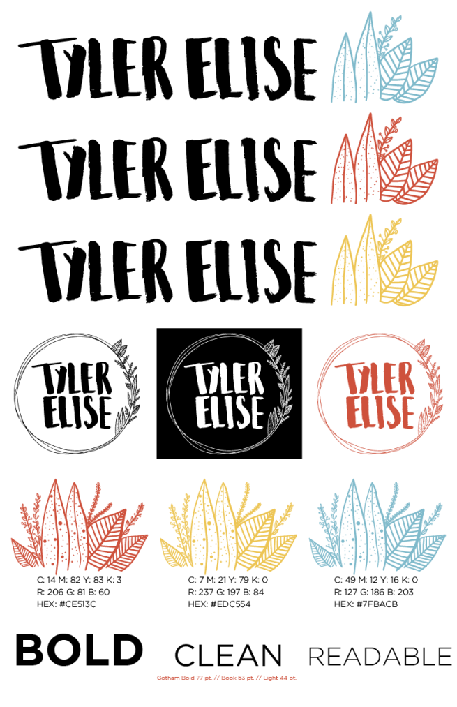
When I first sketched the circle with the floral elements I originally had my name hand lettered in a nice cursive, which was pretty, but it didn’t feel like “me.” I wanted to figure out a way to keep that circle/floral element but make it correlate more to who I am. I used watercolor pens to try out some brush lettering and voilà! The strong lettering next to the floral and light hand drawn elements really related more to who I am. The juxtaposition of hard and soft really resonated with me. So I went for it! I think I drew about 50 different circle/floral elements before I thought one was good enough to vectorize, but I decided to save you the time and only post one of the pages ;).
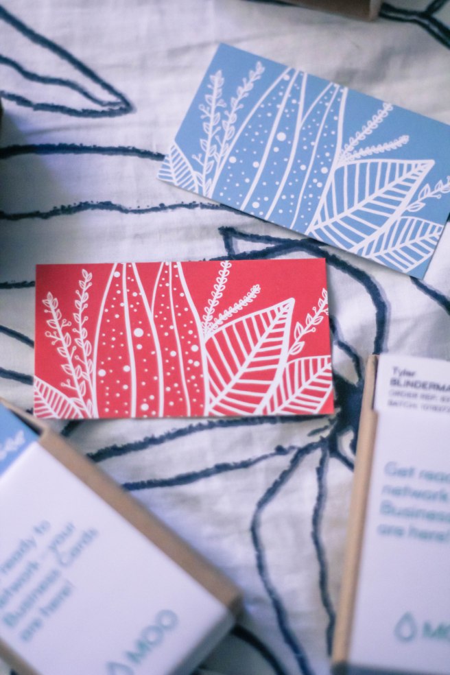
Then it was time to vectorize the logo and start creating things such as my resumé and business cards. As I started to use my vectorized logo I realized that the circle was fitting awkwardly in places and looked almost too much like a crest of some sort. This is where I brought in some alternates. After creating most of my designs I realized that my alternate, horizontal, logos were becoming my primary logos. At first I was so in love with the circle one that I was hesitant to make the decision to push it back to being a secondary logo, but I did and I feel very strongly that this was a good decision. The horizontal logo felt stronger, and like it was placed on pieces like my resumé and business cards on purpose, where as the circle logo felt a bit accidental and like it was placed wherever because it didn’t fit properly anywhere.
Below is my final brand board of all of my colors, type choices, graphic elements, primary and secondary logos:
This process really took a lot of soul searching, trust in myself and most of all, sketching, and it’s only the beginning!
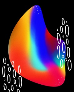
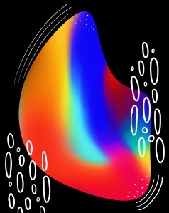
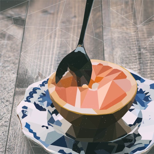 Even though I’ve been keeping somewhat busy with some freelance work I still have a decent amount of time to work on some side projects. I hadn’t done a geometric poly art piece in a while so I figured I would try my hand at another one.


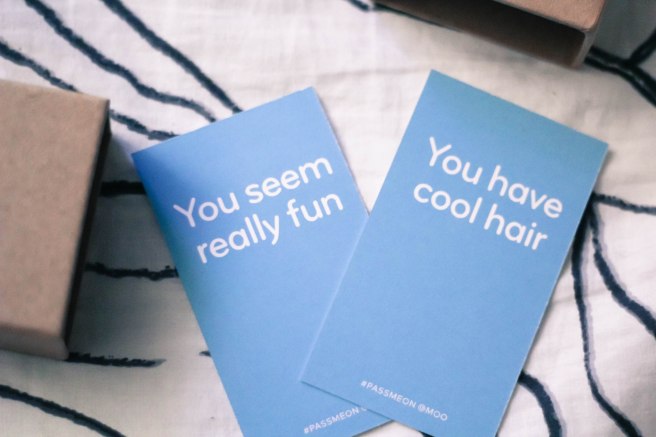
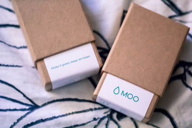 There is something so awesome about holding something tangible that you’ve worked so hard on. Opening my package from Moo this afternoon felt so incredibly rewarding!
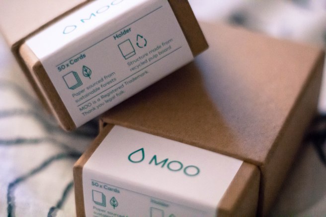
 Think you have a good idea of who you are and what defines you? Try branding yourself THEN answer that question!